


A challenging assignment!
Psychic Medium Debbie Squizzero wanted to take her business to the next level by getting a professional logo done. Debbie has big plans and many ideas for her business, and knew that she wanted a brand image as unique as her abilities.
Carrie Coren Design started this assignment like all projects, by spending time talking to Debbie to get to know her, discuss what makes her business different, and listen to any ideas she already had in mind for her brand look. Debbie was already doing a lot of social media posting, using a pink color theme, and requested that I stick with pink and pastels.
This was challenge number one. Representing Debbie’s personal energy with a pastel palette was an interesting hurdle. The vibe I got from Debbie was very high energy, and I felt bright, vibrant colors would better represent her personality.
Challenge number two was fighting against all of the traditional images that came to mind when I thought of a psychic; wings, clouds, angels, you know, all the cliche visual metaphors.
The solution
Carrie Coren Design developed many graphic solutions, and narrowed it down to five to present to Debbie. Typically, I only show three choices. It can be confusing for a client to have too many choices. But in this case I trusted that Debbie would know the right logo when she saw it. And she did.
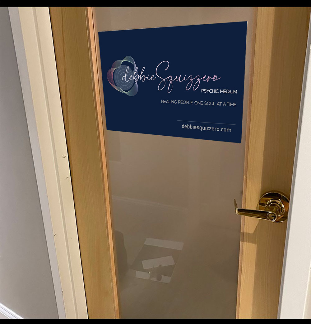
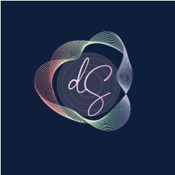
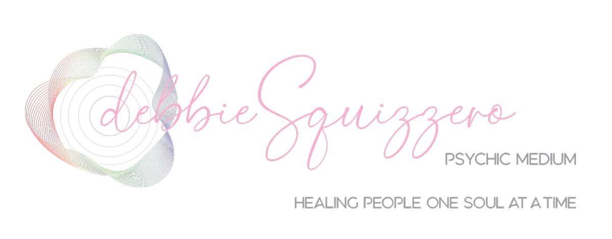
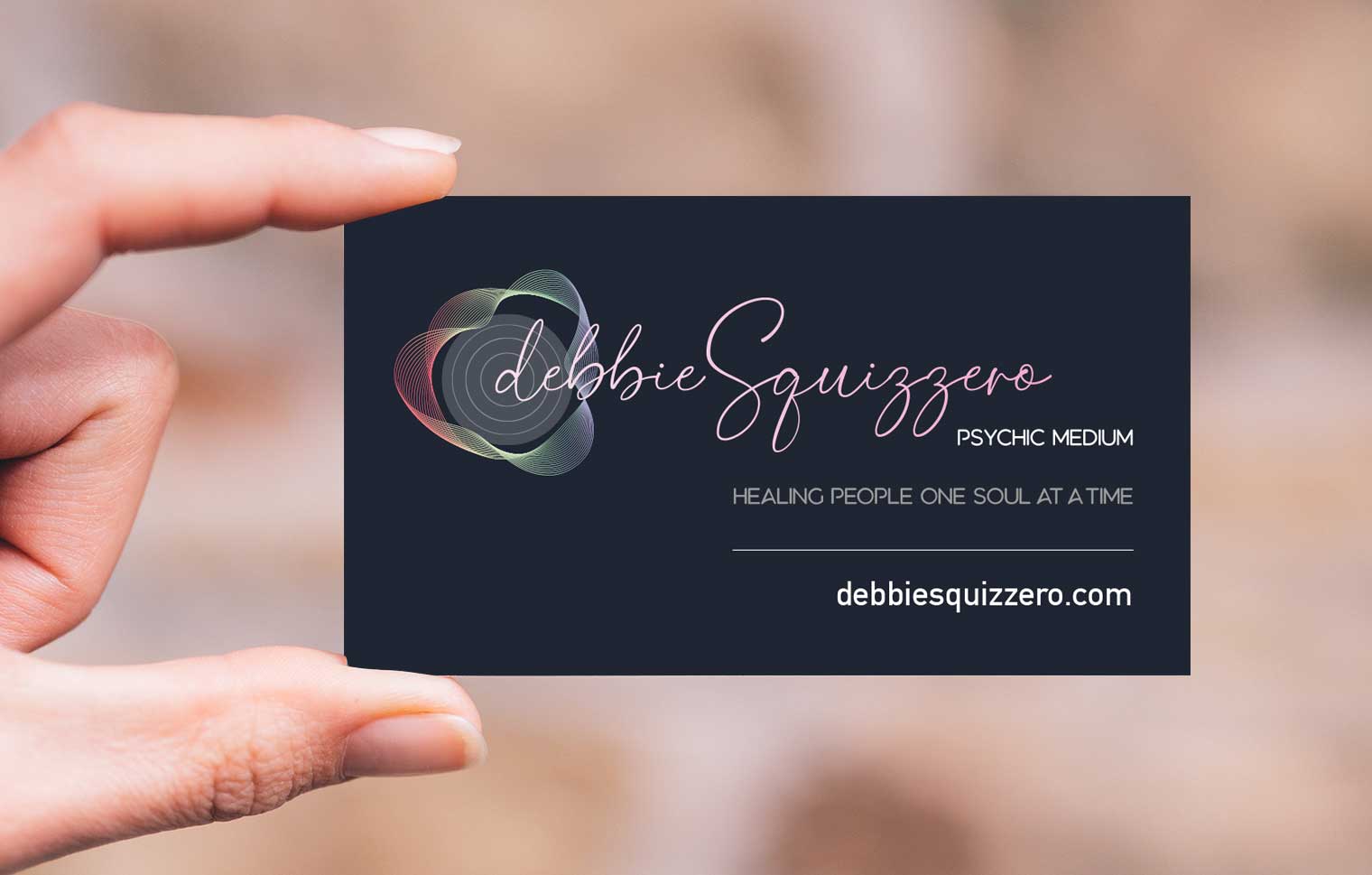
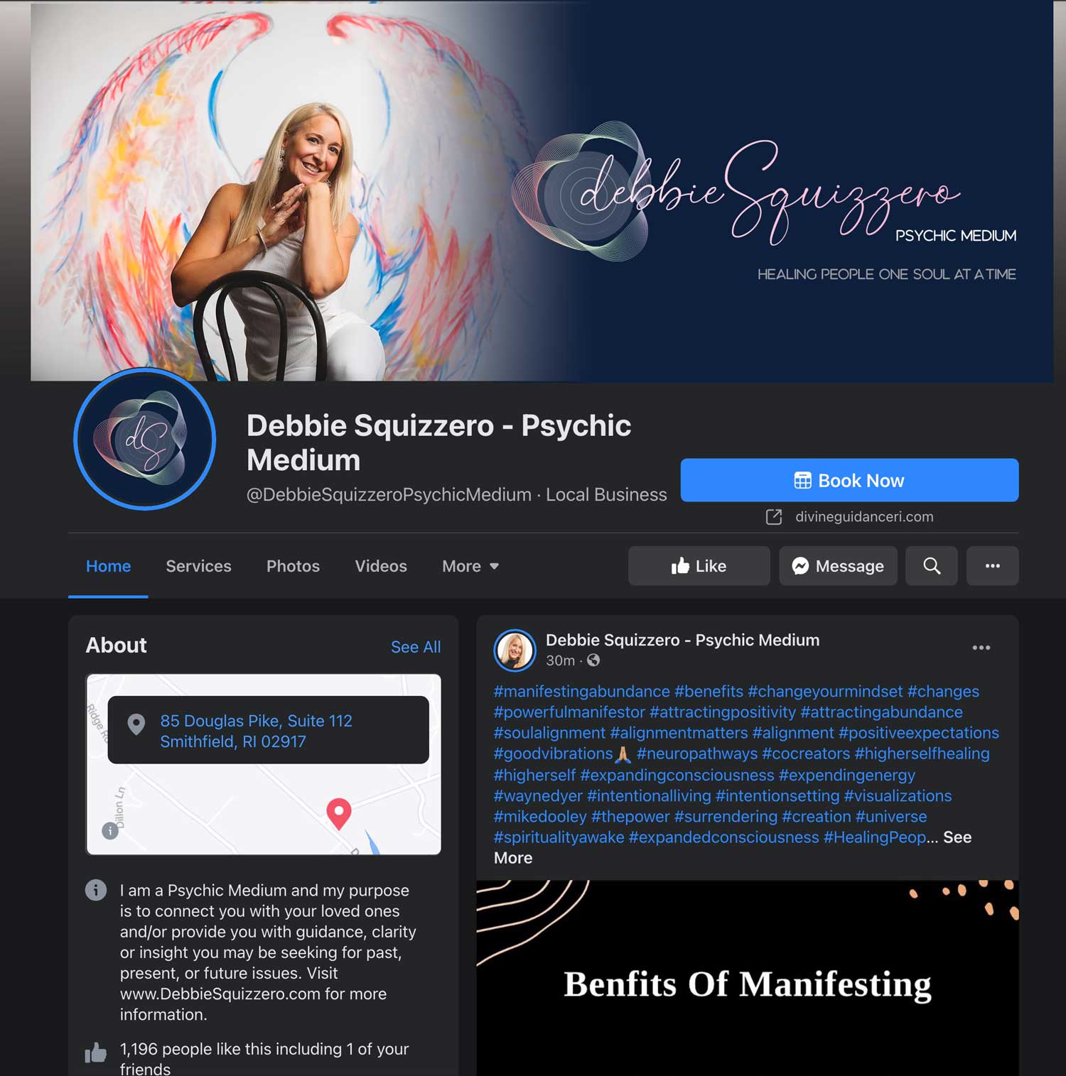
The final design is called Aura. It represents both Debbie’s personality and the way her gift works.
There are vibrant colors in the aura, but because the lines are so fine, the intense colors appear to be pastel. In that way I was true to myself as a designer and fulfilled the client’s vision.
And of course, her name is in pink, which she loves.
What’s a style guide?
As part of the project, I provided a style guide to Debbie. For those that may not be familiar with the term, a style guide is the “rule book” for color breakdown and fonts, among other things. Some clients want to be able to create materials on their own, so understanding CMYK vs RBG is really critical. It’s advanced stuff, so I’m always happy to provide guidance on which type of file is used for printed materials (CMYK) vs. digital (RGB), or which file should be sent for a t-shirt vendor (.eps or .pdf) vs. the local newspaper (png, pdf or jpg).