

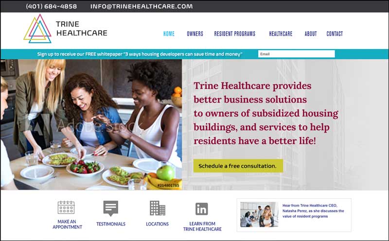
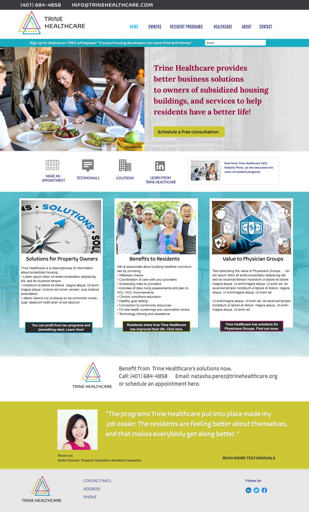

This project started with web developer Robin Clapp hiring Carrie Coren Design to design the website for one of her new clients, Trine Healthcare. In this case. the branding had already been done, but I used my marketing background to design a effective homepage.
An effective home page should do the following:
- Immediately answer the question “What can this person or company do for me?” in a concise and clear manner. Visitors will leave the site quickly if they don’t see the value in staying.
- Persuade users to engage with the site, usually done with a call-to-action button. In this case, a button with “Download a FREE whitepaper” was used, and also worked to collect emails for future conversations.
- Be well-organized and tell users where to look for various things. Visitors should get an overview of what information exists on the website.
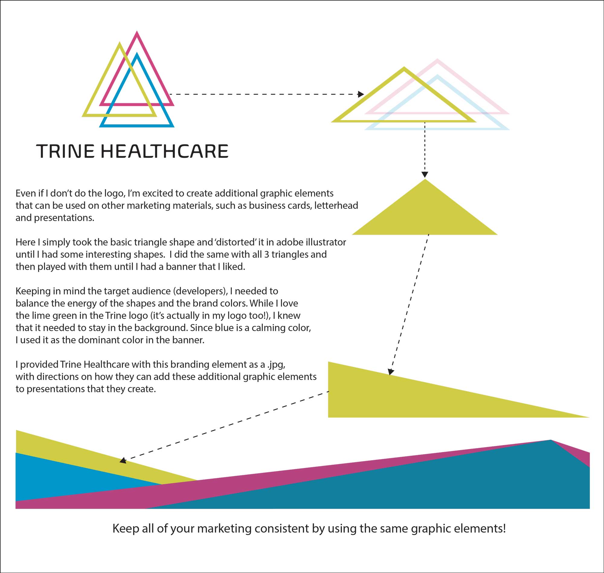
- Reinforce the branding, especially important with a new business. Keeping in mind the target audience (developers), I needed to
balance the energy of the shapes and the brand colors. While I love the lime green in the Trine logo (it’s actually in my logo too!), I knew
that it needed to stay in the background. Since blue is a calming color, I used it as the dominant color on the homepage.
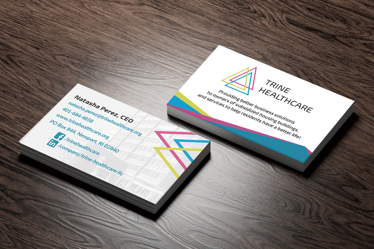
Creating branding elements from the logo
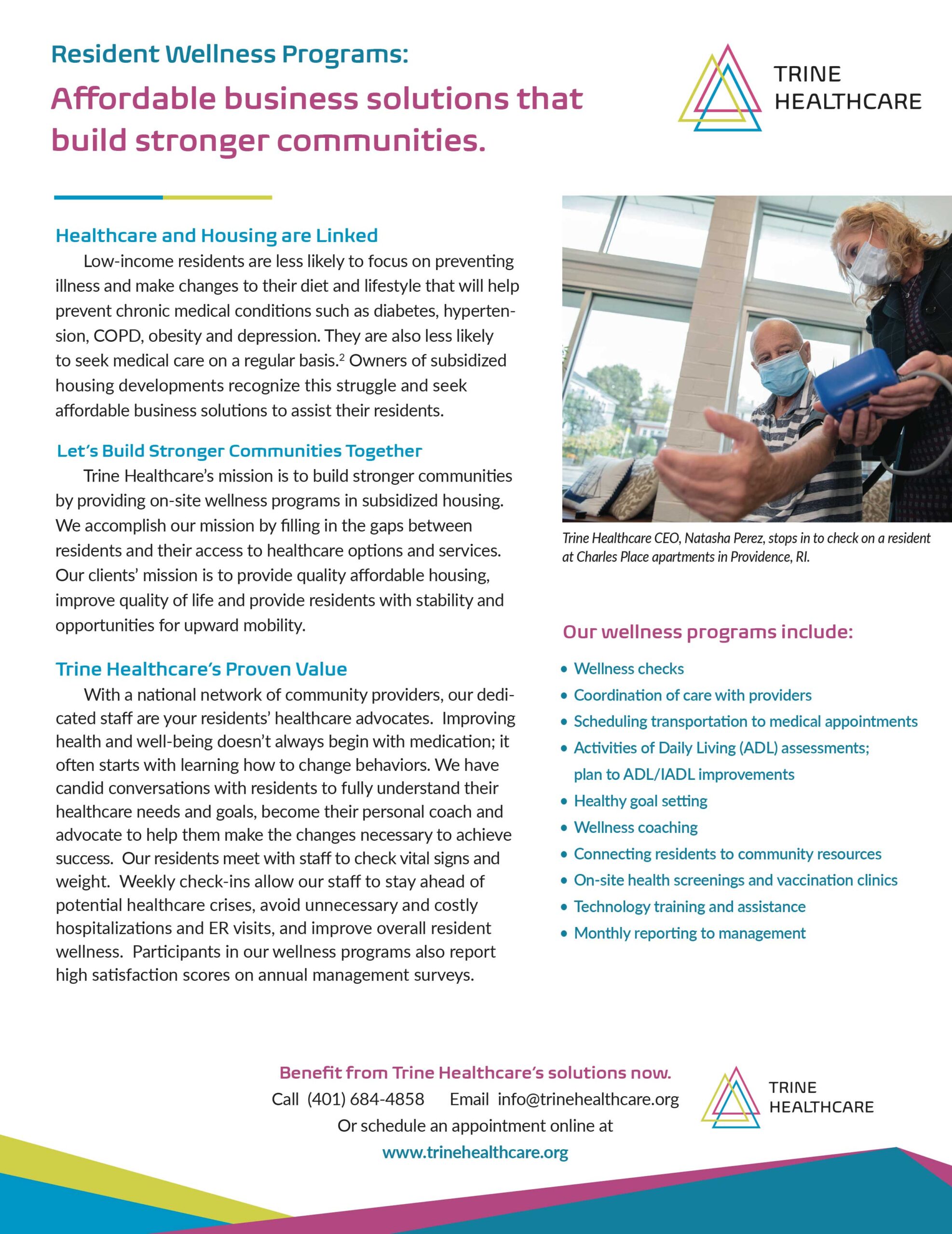
After the homepage design was approved, Trine Healthcare asked Carrie Coren Design to work on the white paper. I developed graphic elements from the logo that were used as borders in the white paper.
Check out this visual showing how I used the basic triangle in the logo to create dynamic graphic elements for future collateral!
Trine Healthcare provides better business solutions to owners of subsidized housing buildings, and services to help residents have a better life! It’s been a pleasure working with such a worthy organization.